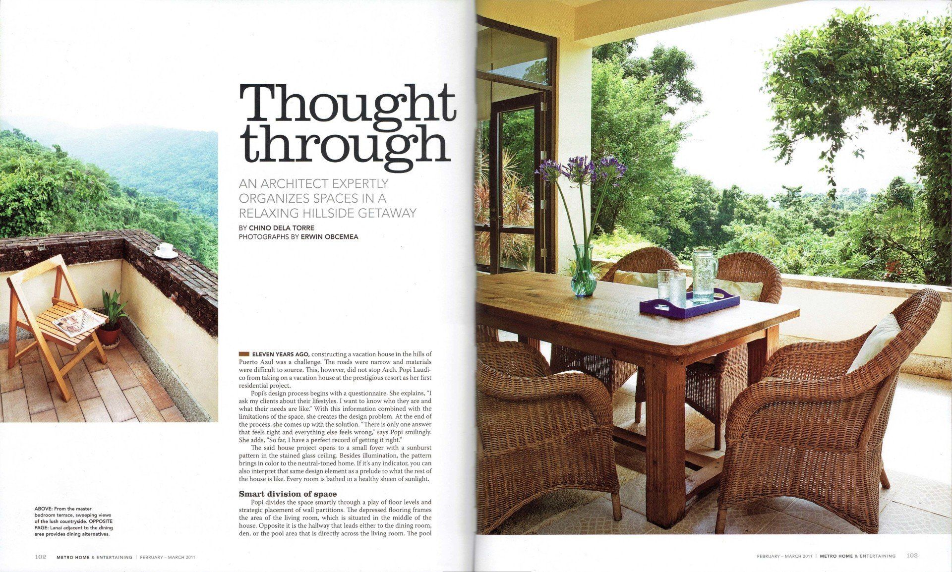
Thought Through
An architect expertly organizes spaces in a relaxing hillside getaway
Metro Home & Entertaining
Vol. 8 No. 1 February - March 2011, pages 102-109
By Chino dela Torre
Photographs by Erwin Obcemea
Eleven years ago, constructing a vacation house in the hills of Puerto Azul was a challenge. The roads were narrow and materials were difficult to source. This, however, did not stop Arch. Popi Laudico from taking on a vacation house at the prestigious resort as her first residential project.
Popi’s design process begins with a questionnaire. She explains, “I ask my clients about their lifestyles. I want to know who they are and what their needs are like.” With this information combined with the limitations of the space, she creates the design problem. At the end of the process, she comes up with the solution. “There is only one answer that feels right and everything else feels wrong,” says Popi smilingly. She adds, “So far, I have a perfect record of getting it right.”
The said house project opens to a small foyer with a sunburst pattern in the stained glass ceiling. Besides illumination, the pattern brings in color to the neutral-toned home. It it’s any indicator, you can also interpret that same design element as a prelude to what the rest of the house is like. Every room is bathed in a healthy sheen of sunlight.
Smart division of space
Popi divides the space smartly through a play of floor levels and strategic placement of wall partitions. The depressed flooring frames the area of the living room, which is situated in the middle of the house. Opposite it is the hallway that leads either to the dining room, den, or the pool area that is directly across the living room. The pool area cuts the structure of the house to form the letter “U”. This allows more window space for the rooms in the first and second floors, and increases natural lighting for the household. Most rooms have a view of the pool, which serves as a focal point for the house.
Used to running hotels, the owner requested for a complete kitchen. “I partitioned the kitchen space in such a way that the hot area was opposite the cold, and the wet area was opposite the dry. In the center is a working island that serves as a virtual bridge among the area,” explains Popi. The kitchen is equipped with a built-in stove, two sets of oven and the large Sub-zero refrigerator that had to be brought all the way from the US.
Popi loves clients who invest well in the project. She recalls an incident when she got a call from owner who was abroad at that time. “There were hand-made terracotta tiles that the owner really liked and was wondering whether it would match the house. I said if you really like them, buy them. They’re going to fit,” chuckles Popi. The owner ended up hand-carrying the tiles from abroad. The tiles are now displayed beautifully as the splashboard for the hot area in the kitchen.
Panoramic view of the outdoors
The staircase that leads to the second floor is treated with sandstones, including the adjacent walls. Popi placed mirrors in the wall pockets that followed the lines of the window. She adds, “I played with the positive and negative spaces. I used mirrors to create a sense of gap. It breaks the massiveness of the solid stone. Plus, it brings in more light to the space.”
The staircase opens to a hallway that is dressed with three panels of floor to ceiling windows on one side. This maintains the symmetry with the three glass panels that connect to the pool on the first floor. The hallway gives access to all the bedrooms. It elevates towards the end, creating a separate landing for the master bedroom. The bathroom is beside the entrance so that the bed space would take centerstage amidst all the scenery. The bed is flanked by windows on either side and glass double doors at one end, creating panoramic view of the outdoors.
It was the owners who picked the furniture pieces, which are mostly made of wood and natural materials. The items have a casual cozy feel that blends well with the aesthetics of the space. Popi used sandstones mainly as the flooring option. “I want to use the more natural version of the look I’m going for”, she explains. Decorating the house are artworks painted by the owners themselves. “I love their paintings”, says Popi. “They bring in that personal touch that gives a home its own identity and style.”
People have asked Popi what her design style is. “I really don’t have an answer,” she explains. “There is no specific look or style that is related in any of my projects. It is never the same site, never the same client, and never the same lifestyle.” The end goal in Popi’s designs is creating that unique style that is purely about the client. “If you don’t see me in my works, then I did a good job,” explains Popi.
The owners are so happy with their vacation house that they commissioned Popi to do their home in the city, too.
Featured Project:


