Popi Laudico Redesigns Bayo
Bayo, the fashion store of dream summers all year round, has redesigned its store at SM City North EDSA. Its lit pink doorway is a fitting gateways to the many candy-colored delights inside.
Architect Popi Laudico designed the packed 90-meter square.
"We wanted to create an easily identifiable look. In the retail industry, usually when you reach five stores, you freshen your look. We already have 3 so we thought is was time for something new," says Yvette Dizon-Lejano, manager and co-owner of the family-owned fashion chain.
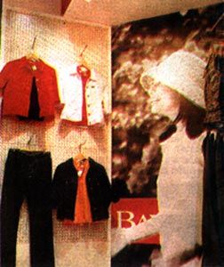
The eye-catching candy pink entrance sets the overall tone. "It's a color we want to be associated with," says Lejano. "It's not just pink, it's not just red, it's us." The lighting is bright, the better to highlight the clothes. While the mix of basic walls, enlarged photographs and mannequins are still there, it is the way these elements are put together that's new. There are more and bigger visuals, and mannequins are not just used in the window display but everywhere. The clothes, as in the past, are arranged according to colors. The new lines are usually displayed out in front.
The customer-friendly arrangement has been adapted to coincide with Bayo's new marketing direction: to sell a lifestyle more than just clothing and accessories. The photographs of image model Stephanie Zubiri show the young lady wearing Bayo's clothing in school, on the streets, hanging out in the park, emphasizing that Bayo is comfortable, fun, functional, and practical. Bayo has also opened its newest outlet in SM Manila.
Featured Project:


